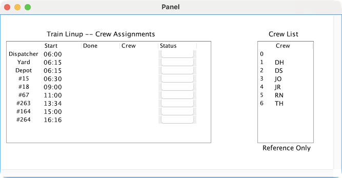
The LogixNG table icon can be added to a Panel Editor panel to display the contents of a LogixNG table. The table can be read only, editable or with only selected columns editable. It is also possible to have columns with buttons or dropdown lists.
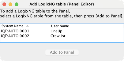
The LogixNG panel icon type is selected from the Panel Editor icon type list. This will display a list of LogixNG tables.
The table icon is added to the panel at a default location with a default size.
The table icon does not support dragging to change the location or the size. Use the Set Location context menu item to set the x and y coordinates. For the width and height, use the Fixed Size ⇒ Set Fixed Size… context menu item.
Except for the first column, the width of the other columns can be changed by dragging the column separator. The current column sizes are saved with the table icon when the layout data is stored.
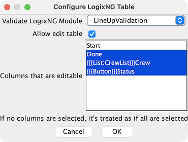
The Configure LogixNG Table context menu item displays a dialog to configure the icon.
This is the master switch to enable/disable editing of table cells. Changing cell content is temporary. When PanelPro is stopped, the changes are lost. The source CSV/TSV file is not changed. Permanent LogixNG table changes have to be made outside of PanelPro.
The first column in the table is not listed and its cells cannot be changed. If none of the others are selected, then cells for all of columns can be changed. If one or more are selected, then only the cells for the selected columns can be changed.
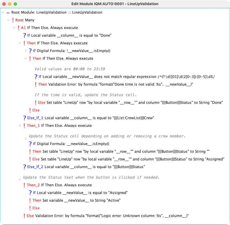
A LogixNG Digital Action module can be used to validate cell changes. Select a LogixNG module from the list. It will be called after the user has edited a cell, but before the new data is written to the cell. If the data is invalid, the module can abort the editing by calling the Validation Error or Error actions.
The configuration settings are also saved with the table icon when the layout data is stored.
A button is defined by the header of the table column starting with {{{Button}}} followed by the column name, for example {{{Button}}}Status. The button click is handled by the Validate LogixNG Module logic.
A dropdown list is defined by the header of the table column starting with {{{List:TableName}}} followed by the column name, for example {{{List:CrewList}}}Crew. TableName is the system name or the user name of a LogixNG Table with the items for the dropdown list.
When the module is called, a set of local variables is included. The local variable names have two underscores at the front and two at the back.
The basic logic structure for a validation module is a if-then-elseif-else pattern with a section for each editable column.